Dashboard Usability Study
Navigation redesign improved usability by +75%
Results
Success Rates
The Challenge
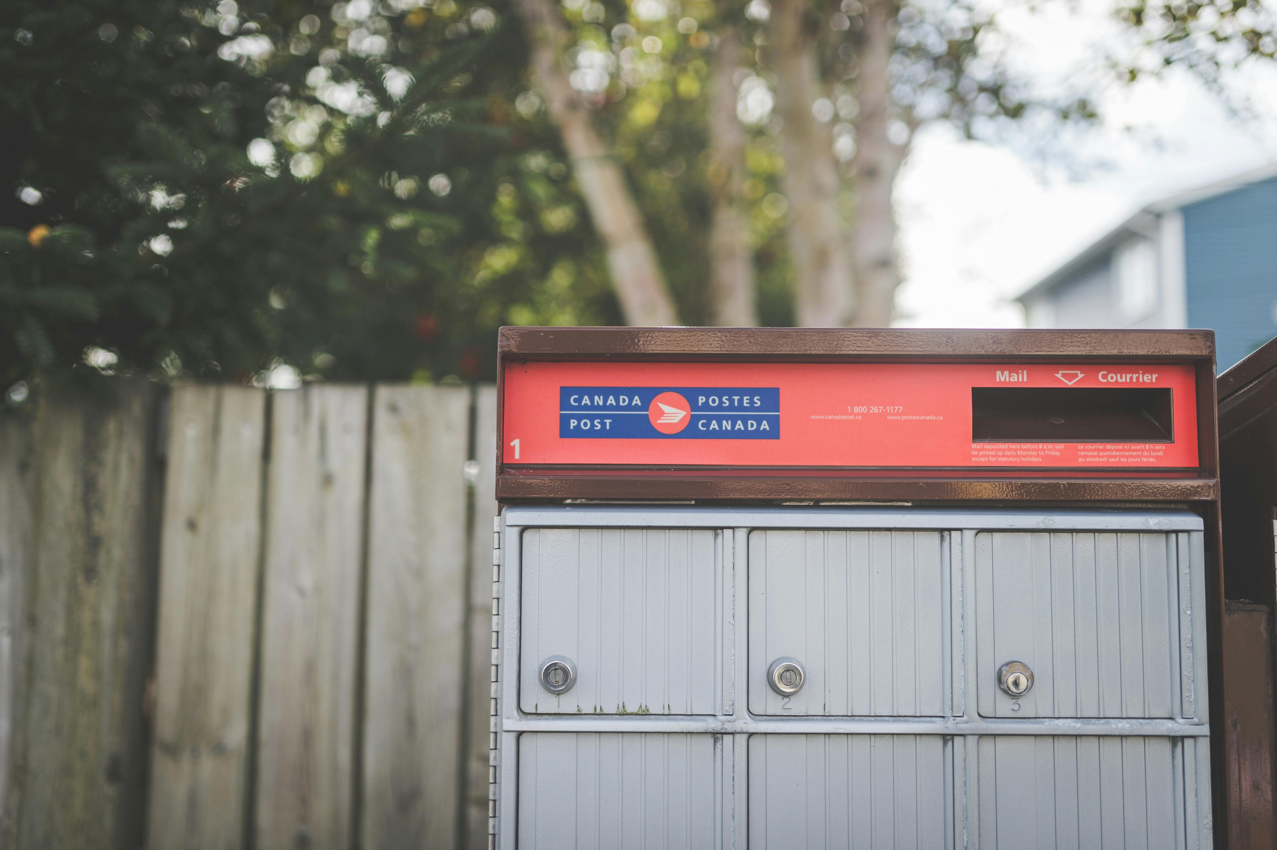
The Canada Post customer dashboard had grown organically across several product cycles. Each new feature was stacked on top of the last, with no structured usability review in between. Stakeholders suspected that navigation friction was causing users to abandon high-value tasks, but without a quantitative baseline, there was no way to confirm it, prioritise fixes, or know whether design changes were actually helping.
I benchmarked the experience before and after a targeted navigation redesign, running the same five findability tasks with two separate groups of participants to put concrete numbers behind what had previously been a gut feeling.
User Insights
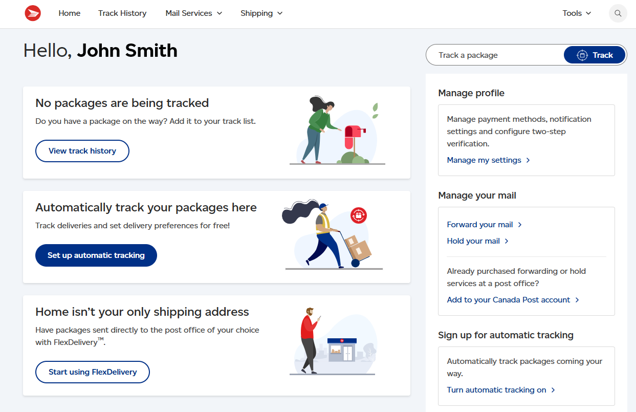
Users were not lost because the information was missing. They were lost because the navigation used the organisation's internal language instead of the user's own words. "Shipment Management" did not map to "find my package history." "Resources" did not signal help. Every label made sense to someone who already knew the system; none made sense to someone trying to use it for the first time.
"I kept looking for something that said 'track'. I didn't think to click 'Logistics Overview' to track a parcel."
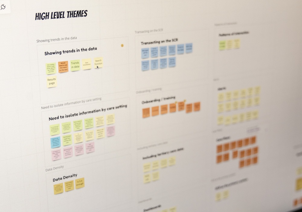
Key findings synthesis

Moderated session observation
What Changed
Working with the design team, I helped relabel the highest-friction navigation items and restructure the hierarchy so it reflected how users describe their goals, not how the product team categorises features internally. Three label changes accounted for most of the measurable gains.
The impact was measurable across every task tested. Shipment history moved from 40% to 85% success, and help options from 50% to 90%, the two tasks where the label-to-task gap was widest. Across all five tasks, average success climbed from 56% before the redesign to 83% after, and no task regressed.
A note on confidentiality
This case study reflects the scale and nature of my work. To protect confidential business information, the scenarios, participant data, and results shown here are illustrative and should not be attributed to any specific organisation or cited as factual research.
Let's connect
Interested in research like this?
Send a message and I'll get back to you within 24 hours.